


Choosing Tile Colours for Sydney Homes
A tile colour scheme works best when you consider the whole entrance: the brickwork, painted trim, front door and garden as well as the floor. For a Federation verandah or tessellated pathway, start with the colours already around the space, then choose a field, border and accent that work together.
Build a palette around your home
Look at the surfaces that will stay after the renovation. Warm brick, pale stone and dark door frames each provide a different starting point. A tile sample placed beside those materials is more useful than judging the colour on a phone screen.
Use these combinations as design starting points, then compare them with our tile colour range:
- Black and white: a crisp contrast for checkerboard, octagon and geometric layouts. Repeat one of these colours in the border to tie the floor together.
- Grey and white: a gentler contrast to consider beside pale render, painted timber and cool-toned paving.
- Red with cream or white: a warm palette to compare against red brick and terracotta details before choosing the final shade.
- Earthy neutrals: browns, creams and related tones can help connect the floor with sandstone and warm timber.
- Green accents: a small amount of green can pick up garden planting, leadlight or painted details without dominating the whole floor.
- Blue accents: use a feature tile or selected part of the border to introduce colour while keeping the main field restrained.
You do not need every part of the floor to use a different colour. Repeating a small palette across the field pattern and border often makes the overall design easier to read.
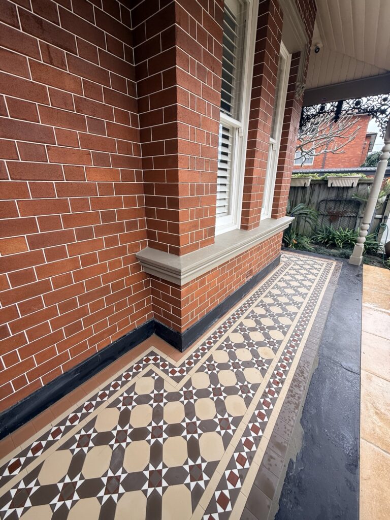
A real example beside red brick: our Drummoyne verandah uses a Nottingham pattern and Windsor border in charcoal, oatmeal, red and white. Compare the close-up with the wider house photographs to see how the same colours look across the entrance.
For other combinations, explore four completed verandahs with different patterns, borders and colours. Use photographs to make a shortlist, then confirm the colours with physical samples.
Check Your Colours Before Ordering
Before confirming the order, compare the actual samples in the place where the tiles will be installed.
- Compare samples in daylight
View samples in both sun and shade if the entrance receives changing light. Screens, photographs and indoor lighting can all make a tile look different from the real finish.
For a photographed example, compare the sunlit detail and shaded close-ups of our Coogee NightBridge verandah. The project uses red, grey, oatmeal, black and white; the different views show why the same palette should be checked in your own light before ordering.
- Coordinate the border
Lay the proposed field colours beside the border colours. Check whether the border should provide a strong frame or blend more quietly with the centre of the floor.
- Choose grout alongside the tiles
Grout is part of the finished appearance. Compare a proposed grout colour with the tiles and discuss suitable products for the location with your installer.
- Send photos for advice
For an existing heritage floor, send an overall view and close-ups of the field, border and damaged area, with a ruler beside the tiles where possible. Size, thickness, finish and colour all affect a match; a similar screen colour is not enough. Our tile restoration and matching guide explains what to record before choosing replacements.
Federation Tiles Factory manufactures tiles in-house, with installation across Sydney and Newcastle and supply Australia-wide. Send photos, your suburb and approximate measurements for help selecting a palette. Samples can be shipped when an on-site consultation is not possible.


